WELCOME TO MOM'S STORYTIME
Formerly “blogs,” but what a blah sound blogs has! At SBD we know that telling visual and verbal brand stories is the most powerful tool in our bookshelf. Gather 'round, read some of our stories. We look forward to creating great brand stories for you!
ABOVE: Logo Design by SBD
At SBD Agency, we love creating logos for our clients. It’s at the heart of what we do as a marketing agency, the centerpiece of branding. One unique and memorable icon, your name in a standout typeface, and a wickedly cool color scheme encapsulate your brand at a glance. And we love the process. Getting to know your company in and out, getting to know your target audience, working collaboratively with you through a series of logo iterations to arrive at the perfect representation of your company.
As much as we love branding and logo creation for all our clients, we welcome the opportunity to design a logo for a fellow designer. First off, to have a designer - in the case of Creekstone, a design-build remodeler - choose your agency to create the centerpiece of their brand assets, is an honor. Second, it’s a fun - and challenging - chance to collaborate with a fellow creative.
With Creekstone, we began with our signature brand questionnaire, a document of questions that delve deep into a company’s brand personality. Challenges came as our client followed his own creative process, first trying to determine whether he wanted the company to be named after him, or to use a more evocative name.
ABOVE: Logo exploration and evolution of the brand
Accordingly, we first designed logo possibilities for John May Designs, then JM Design + Remodel, combined with very architecturally inspired icons. The client came back with a concern that he may want to sell the company at some point. We generally advise that a company that may be seeking to sell at some point, disassociate themselves from the owner, expanding the brand to the company. John liked the name Creekstone, a word that evokes a calming, enchanted feel – who doesn’t love the sound of water flowing over stones? With Creekstone, that feeling of relaxation transfers to the company. Relax, we have your redesign handled.
Collaborative work began on an organic logo that worked alongside the name to accentuate the emotional feeling. However, the client pivoted, saying that he really wanted to return to a more architectural icon, one that reflected the exactitude of his work. After a few iterations, the final logo, at the top of this page, was selected. The eye catching 3D trompe-l’oeil icon, with its contemporary, precise, intersecting lines, conveys in a glance Creekstone’s design style. Which tends to be elegant, precisely aligned to their customer’s expectations, and modern.
In addition to the new name and logo, we worked on a website design and photo styling for Creekstone. For his website, the client wanted a novel look, an architectural use of the space that reflected his own elegant contemporary designs. We created the home page using a combination of photos of his work punctuated by complementary geometric shapes that quickly catch the eye and convey information, plus reflect the geometric flow of the logo.
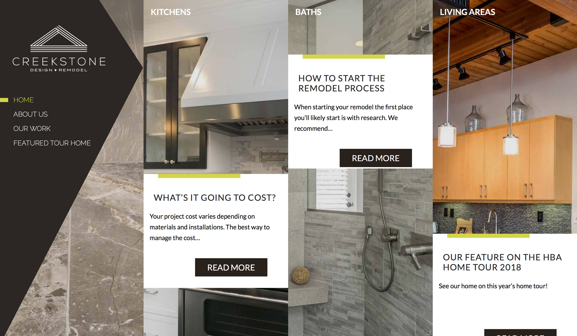
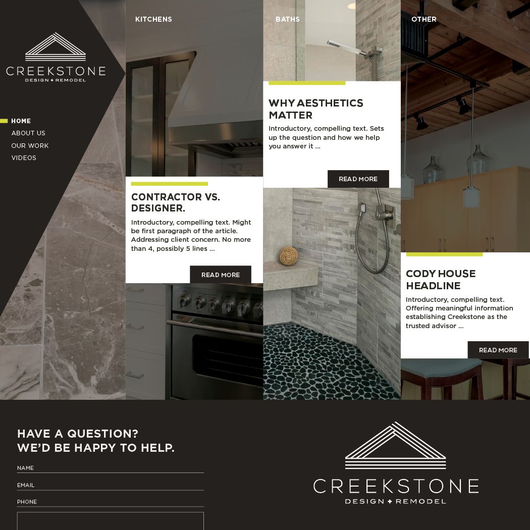

WEBSITE DESIGN
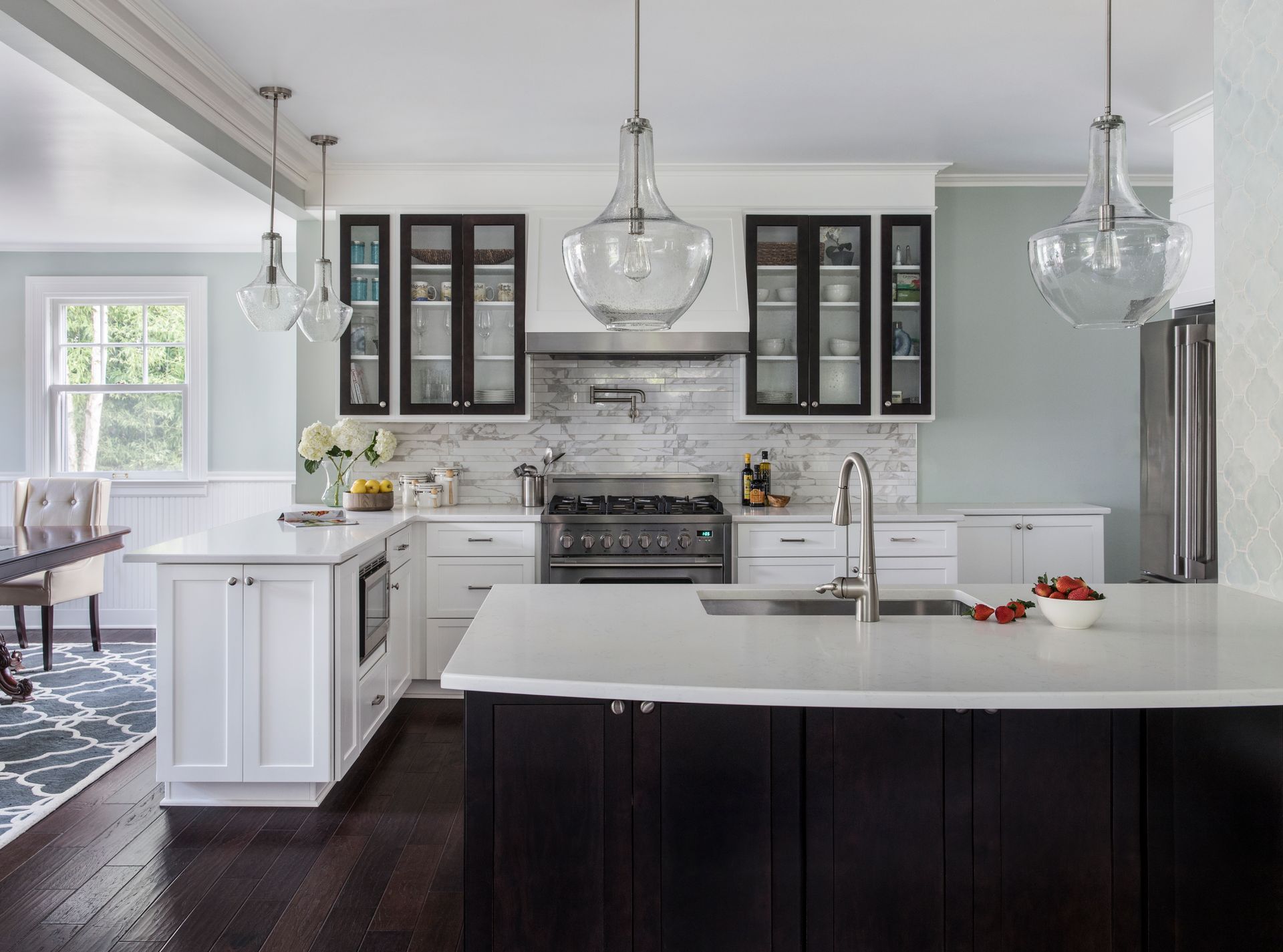
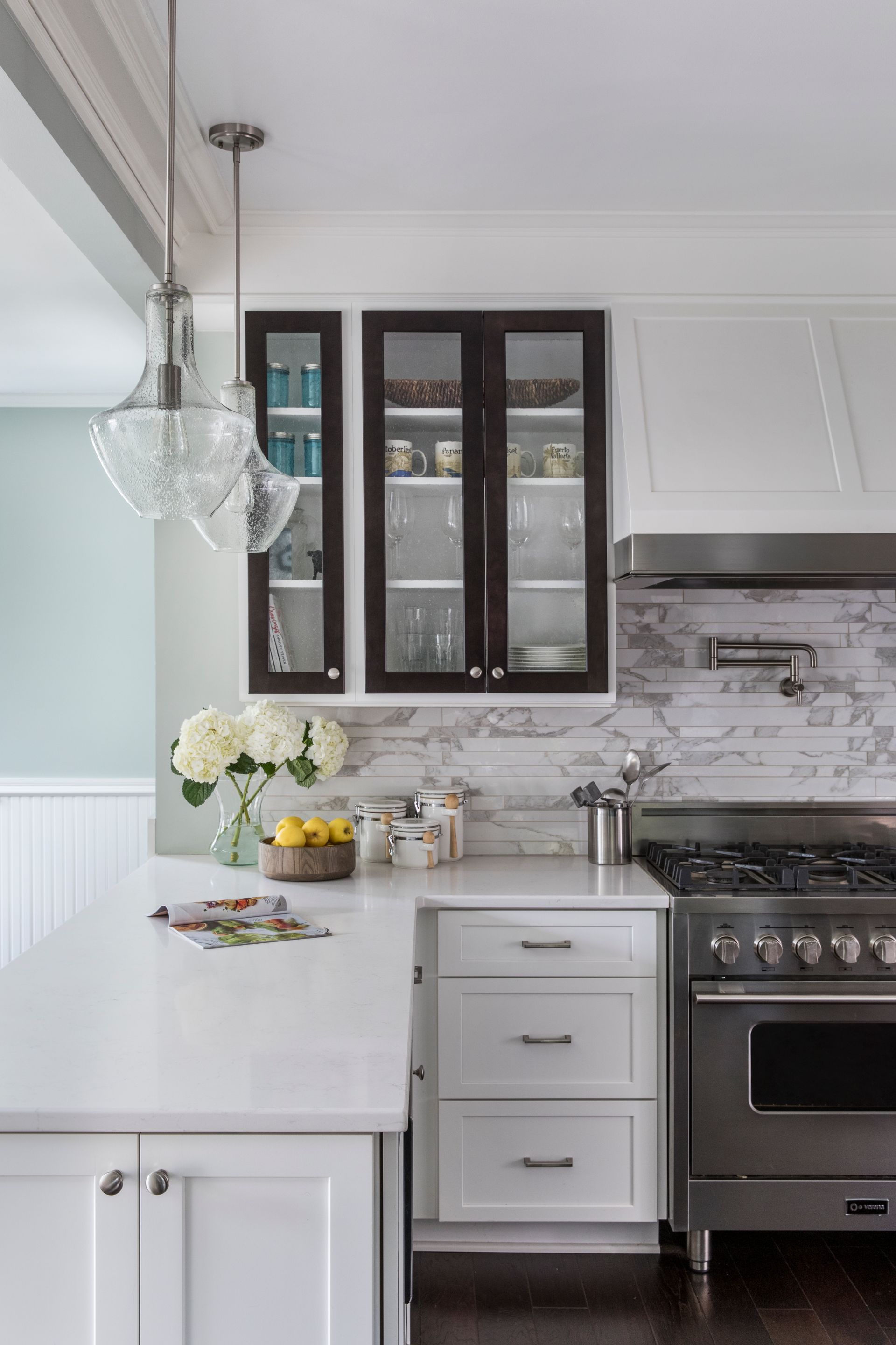
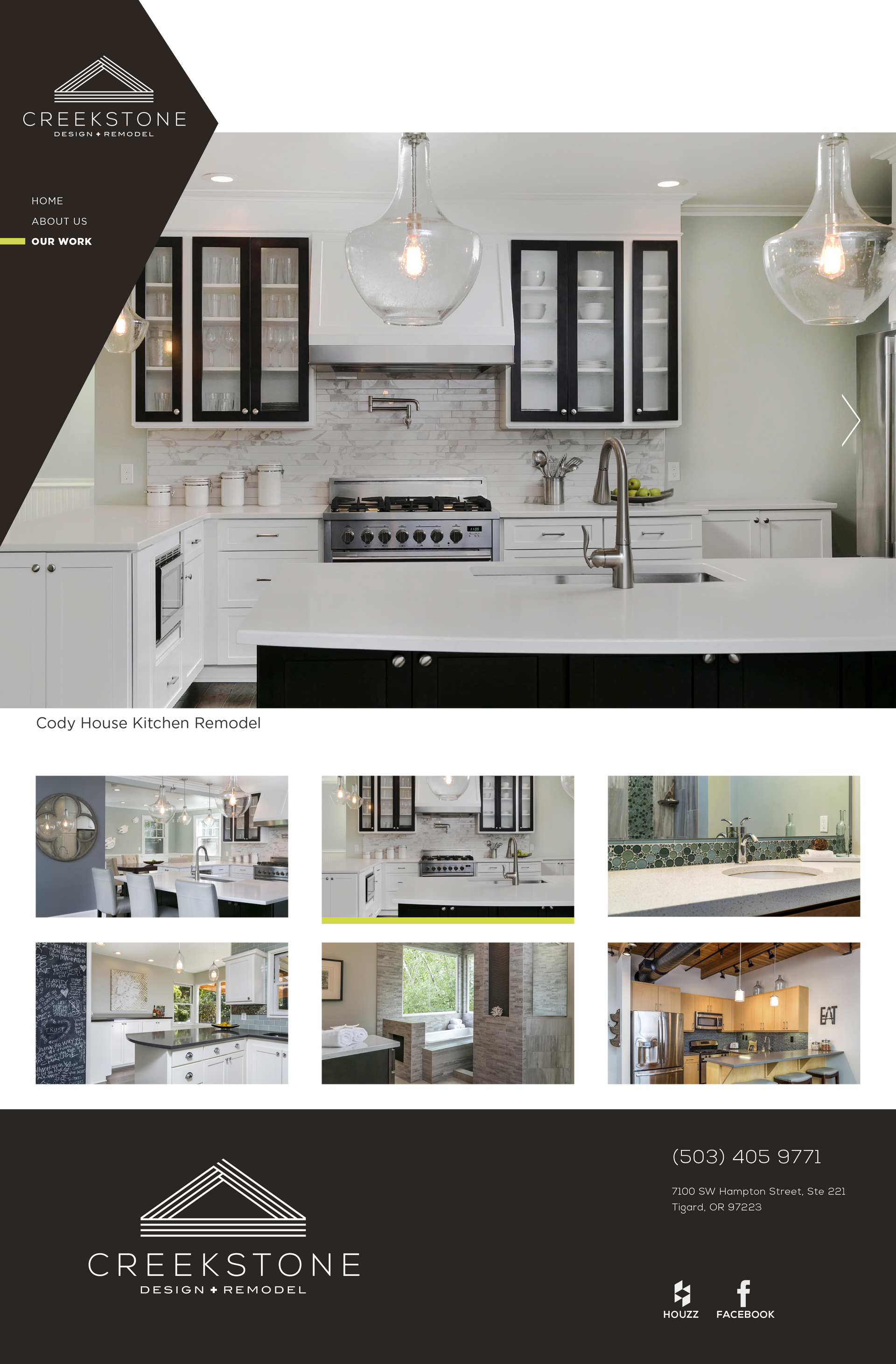
John May originally knew of Snow Blackwood, SBD’s owner, due to her time with Oregon Home, so he knew she was an expert in creating photography that would get picked up for editorial coverage. We coordinated all aspects of the photoshoot with the client, homeowners, and prop suppliers, including hiring photographer David Papazian, matching his clean style to Creekstone's contemporary designs. We rearranged the kitchen cabinets with light colored dish ware, brought in splashes of color with fruits and flowers, set the scene with an open magazine, and was on set all day to make sure all shot requests were correctly executed for the client.